Sometimes all you need is a name. It is a powerful thing. It always has a meaning and, even more, it has a subtext and undertone. A name can speak for itself. It can elicit trust in potential clients and quickly establish the proper atmosphere. As a rule, this name is the one associated with a company. It lies at the heart of the brand and serves as a source for inspiration when it comes to creating a visual identity.
So it is not surprising that instead of using modern features, mind-blowing illustrations or extraordinary typography, creatives prefer to build their designs around their name, using it as a primary detail of the composition. Yes, it can be tricky since you need to turn this minimal approach to your advantage. It requires a vivid imagination and excellent skills. But when done right, it can lead to a fantastic outcome.
To show this in practice, we have compiled a list of business cards centered around a name. There are a number of excellent examples that give you hints as to how to create a name-based card that looks stylish and attention-grabbing.
Nymbl
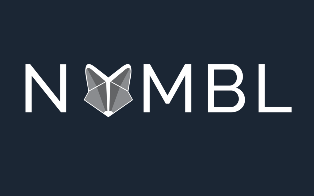
A case in point is Nymbl. It opens our collection with its modest, yet marvelous design. Here, every detail counts. The creative team wants to convey a forward-thinking, experimental nature, along with a playful mood, tech appeal, and of course, personality.
It may seem impossible at first, but they have certainly nailed it. Every detail contributes to this mission – including the gorgeous purple color, luxurious paper material, and bold, intricate letterforms.
BY Studio
BY Studio is a classic example of a minimal business card that has just one word on the front side. It wins over potential clients with its stately and authoritative look. The latter is obtained by three main factors: classy black-and-white coloring, a fantastic letterpress effect and expensive paper.
Elena Demireva
This business card for Elena Demireva is actually pretty obvious, yet it certainly plays into the hands. Elena is an interior designer who is constantly playing with color combinations to create the proper mood. Max Pirsky, who stands behind this brand identity piece, has taken this notion as a base and come up with a bright idea.
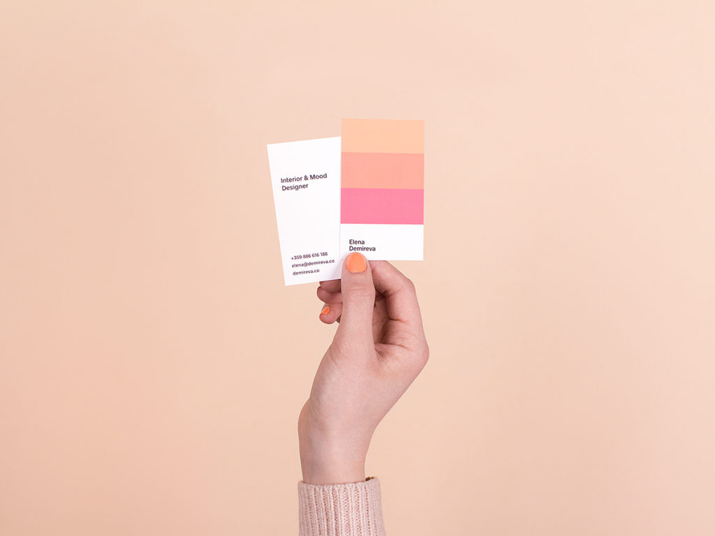
The front side features a small color card and a name. That is all you need to convey the creative personality, show the sphere of expertise and ignite the interest of onlookers.
Soul Scapes
Black color and a holographic surface always form a potent tandem. The business card of Soul Scapes looks incredibly sophisticated. While the flashy front side catches an eye with its mesmerizing appearance and stylish “makeup,” the clean black back side radiates a businesslike appeal. In such a sophisticated environment, you do not need any details or extra features, as you risk ruining the harmony. All you need is the name of the company to complete the ensemble.
Voyager / Frajda
If the holographic canvas is not an option, then you can always try some offbeat abstract designs used as a background. A – Bradley, who stands behind Voyager, along with Magdalena Marchocka, the designer of Frajda, show us how to achieve this.
Each one features only a nameplate on the front side. However, this is enough since the canvases are the main visual driving force. They make the business cards look not just artistic, but also creative and individual. While the first example feels more techy and cold, the second one feels warm and authentic.