When it comes to excelling with visual appeal, there is no better way than to use illustrations on your website. Of course, it is not something that can be created on the fly. Without a good artist at your disposal, the result could be of subpar quality. It will take your money and precious time. However, it is worth it.
Illustrations always seem to please the online crowd. They roll out unique stories as well as intensify the idea behind the project. They are the first things that get noticed, setting tone for the entire project right away.
And even though we can see various trends and ground-breaking solutions, illustrations always remain one of the favorite tools of web artists. They are like black-and-white coloring in that they always remain classic and classy. With one tiny exception – illustrations let your imagination run wild, encouraging you to bring fantastic ideas to life and use as many colors as you want.
As any versatile tool, predictably we can notice trends and preferences in this sphere. Just recently we have seen small icon-sized illustrations that have taken the web by storm. Today human illustrations try to win over the crowd.
TMS / Marie Sahy
TMS welcomes online visitors with a full-screen illustration that demonstrates the agency’s sphere of expertise in a fancy way. It supports the big tagline on the left, making it more prominent. Note, the phrase “We build great apps” may be a bit confusing for non-techy people, but the illustration tries to smooth things over.
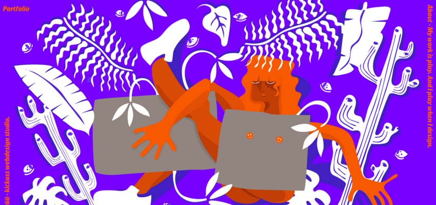
With her bizarre, bold and daring illustration Marie Sahy managed to make a statement. The illustration conveys the free spirit and creative soul hidden inside the artist in the twinkling of an eye. It feels extravagant and at the same time personal. This is an exciting combination.

There was a time when web designers used videos and images to support the idea behind a project. Now, the artworks carry out this mission – bridging the gap between non-tech-savvy people and artificial web applications
BAW Agency / Buster Fetcher
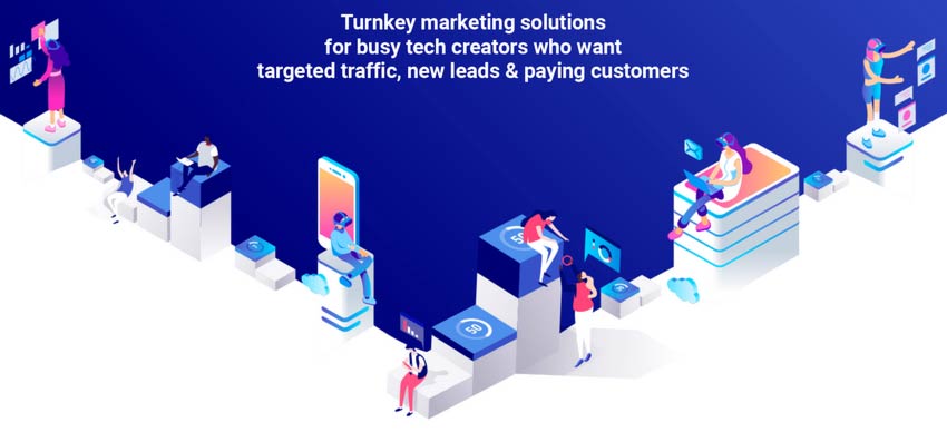
The team behind BAW Agency employs illustration to reveal the meaning of their tagline. You can see busy people that are occupied with their tasks and the application that helps them to sort things out. The artwork feels a bit techy, yet with a certain dose of human warmth.
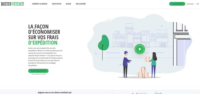
The team behind Buster Fetcher has gone even further. Here you will find not just an illustration, but an entire cartoon that explains to onlookers how the service works. In such a unique way, the team makes complicated things simple. And hand-drawn people assist them in this matter.

Junto Agency
The creative team of Junto Agency prefers a small animation. Their hero illustration is partially set in motion to make the action of the people more evident. It is reminiscent of all those fancy cinemograph pieces that were so popular five years ago. It works effectively as an introduction.
Nam Insik / Closer Game
The personal portfolio of Nam Insik and Closer Game are fully-illustrated websites. The first one is a vivid representative of projects that we have seen a million times. It is a personal portfolio where the tiny human mascot plays the role of a leading actor. He guides the online audience through the story of an artist.

The latter is a new kid in the block. The website promotes a game. It is teeming with illustrations where humans are involved in making the essence of the game clear to potential buyers. Both projects feel personal and have a powerful dose of charisma